
suppressPackageStartupMessages(library(RColorBrewer))
suppressPackageStartupMessages(library(KernSmooth))
suppressPackageStartupMessages(library(raster))
suppressPackageStartupMessages(library(ggplot2))
suppressPackageStartupMessages(library(dplyr))I have been playing around with tracking software and the ways to visualize the position of an animal in an arena over time. Even with normal cameras (30 Hz) and relatively small periods of time (~5 min) we get massive datasets and the only way to make sense of them is to aggregate data over time. I have been interested in neat visualizations (using R), thus here are some ways/comments. I will explore different packages and doing comparisons of the results.
Packages
Data
I have an example dataset with XY position of the animal. I also have other morphological data that is irrelevant for this case. See example below:
         X        Y Orientation MinorAxis MajorAxis
1 325.5522 158.9700   -1.550285  50.47925  130.5679
2 323.3055 156.6896   -1.569706  51.29840  130.3467
3 321.7411 154.8107    1.545683  52.13492  130.3881
4 320.8373 153.3294    1.512549  52.67011  130.6403
5 320.0381 152.5523    1.477299  53.07783  130.1023
6 319.3961 152.2019    1.439171  53.75891  129.6706
I will do some setup that is common for all the graphs (aka, color palette and the dimensions of the arena).
# Get color palette

refCol <- colorRampPalette(rev(brewer.pal(6,'Spectral')))
mycol <- refCol(6)

# define bin sizes
bin_size <- 40

# Camera resolution is 640x480. Hence...
xbins <- 640/bin_size
ybins <- 480/bin_size
ggplot2
The reason I always go to ggplot2 first is because it’s awesome, I buy into the grammar and find it intuitive to accumulate layers over layers. The underlying thought is that ggplot2 handles all problems. In this case, the result has some pros (layers, layers and more layer), and some cons (basically, it doesn’t look amazing).
p <- ggplot(rat_pos, aes(X,Y)) +
  stat_density2d(geom = 'tile',
                 aes(fill = after_stat(density)),
                 contour = FALSE,
                 n = c(xbins, ybins)) +
  coord_equal() +
  theme_minimal() +
  scale_fill_gradientn(colors =  mycol) +
  geom_vline(xintercept = c(0,640))+
  geom_hline(yintercept = c(0,480))

print(p)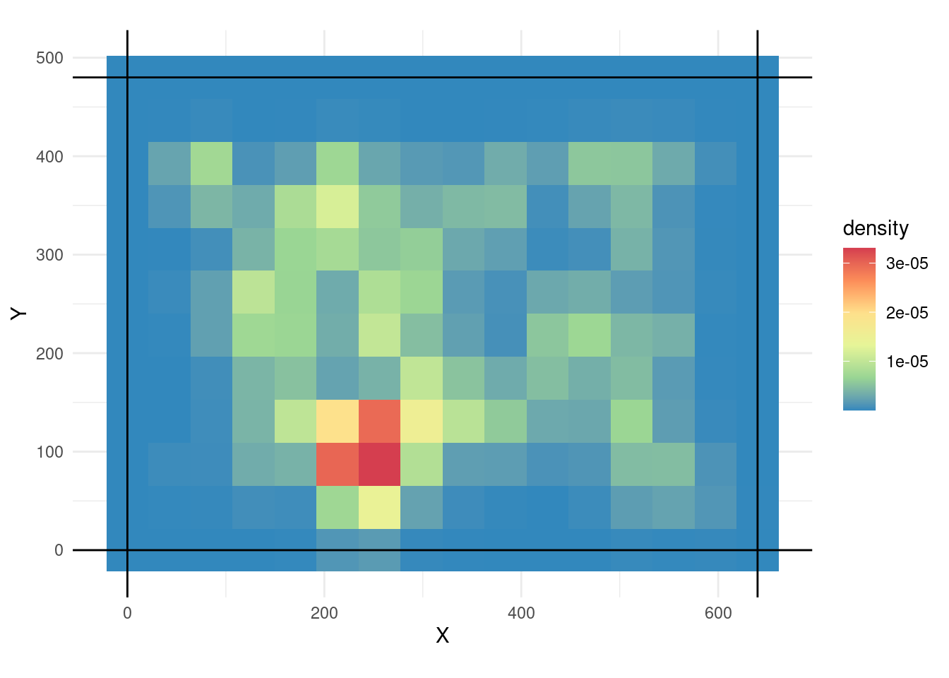
This is interesting because we can overlay things into the plot. For example the trace:
p + geom_path(alpha=0.1)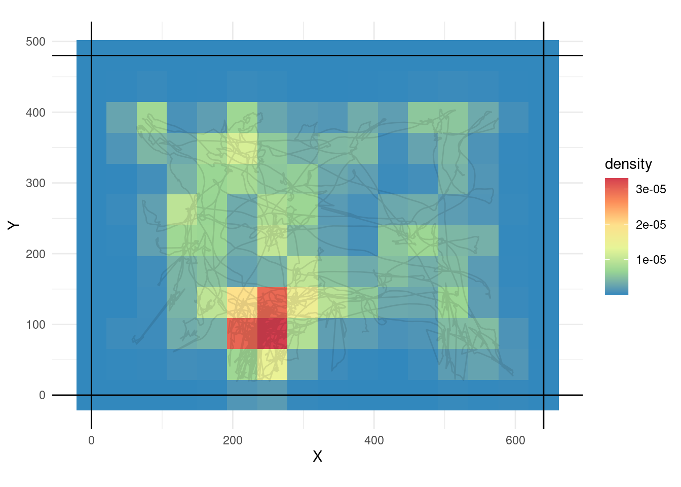
We can further remove the axis (or any other modifications we feel like doing).
p + geom_path(alpha=0.5) + theme_void()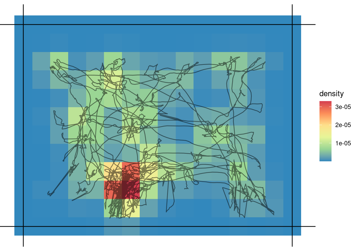
Helping ggplot from outside
I found that, if we calculate the density externally, it looks smoother. This is a mixed, bkde2D mediated, ggplot2 approach (aka the best of 2 worlds).
bins <- bkde2D(as.matrix(rat_pos[,1:2]),
               bandwidth = c(xbins, ybins),
               gridsize = c(640L, 480L))

# reshape
bins_to_plot <- tidyr::pivot_longer(
  data.frame(bins$fhat) %>% tibble::rownames_to_column(),
  cols = -rowname) %>%
  # fix the name column
  mutate(name = stringr::str_remove(name, "X")) %>%
  # convert to numeric
  mutate_all(as.numeric)


ggplot(bins_to_plot, aes(rowname, name, fill = value)) +
  geom_raster()+
  coord_equal() +
  theme_minimal() +
  scale_fill_gradientn(colors =  mycol) +
  geom_vline(xintercept = c(0,640))+
  geom_hline(yintercept = c(0,480))+
  theme_void()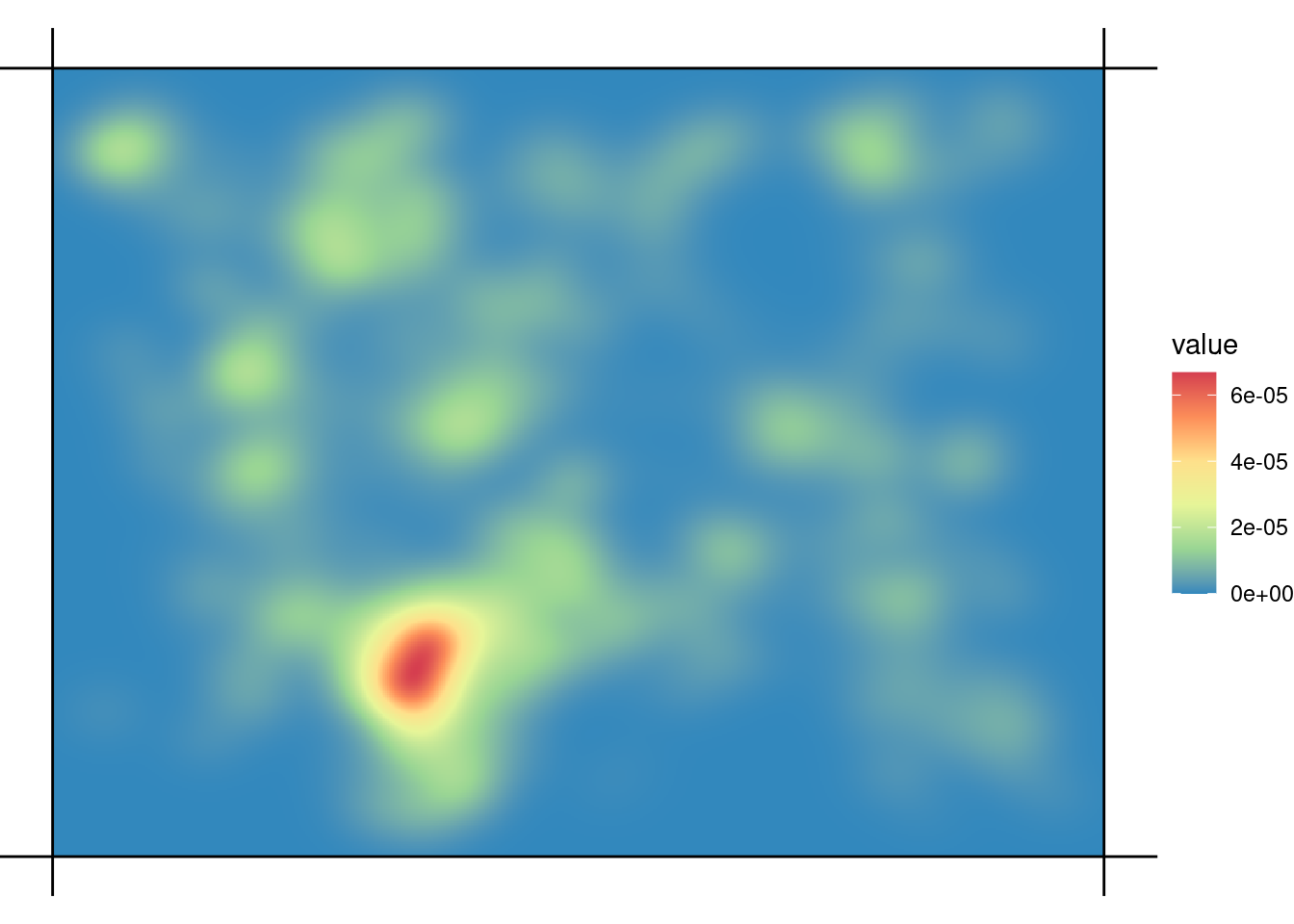
2023 Update
As of 2023, ggplot is able to handle 2D density heatmaps much better. I haven’t played too much with it, but here are some examples
ggplot(rat_pos, aes(X,Y)) +
           stat_density_2d(geom = "polygon",
                           contour = TRUE,
                           aes(fill = after_stat(level)),
                  bins = 8)+
  coord_equal() +
  scale_fill_gradientn(colors =  mycol) +
  theme_minimal() +
  geom_vline(xintercept = c(0,640))+
  geom_hline(yintercept = c(0,480))+
  theme_void()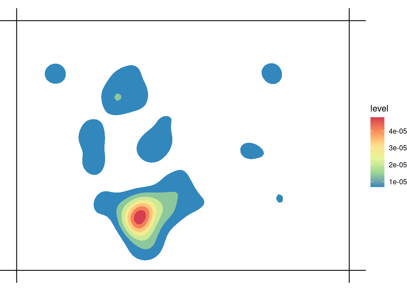
ggplot(rat_pos, aes(X,Y)) +
  geom_density_2d_filled(bins = 8)+
  coord_equal() +
  theme_minimal() +
  scale_fill_brewer(palette = "Spectral", direction = -1)+
  geom_vline(xintercept = c(0,640))+
  geom_hline(yintercept = c(0,480))+
  theme_void()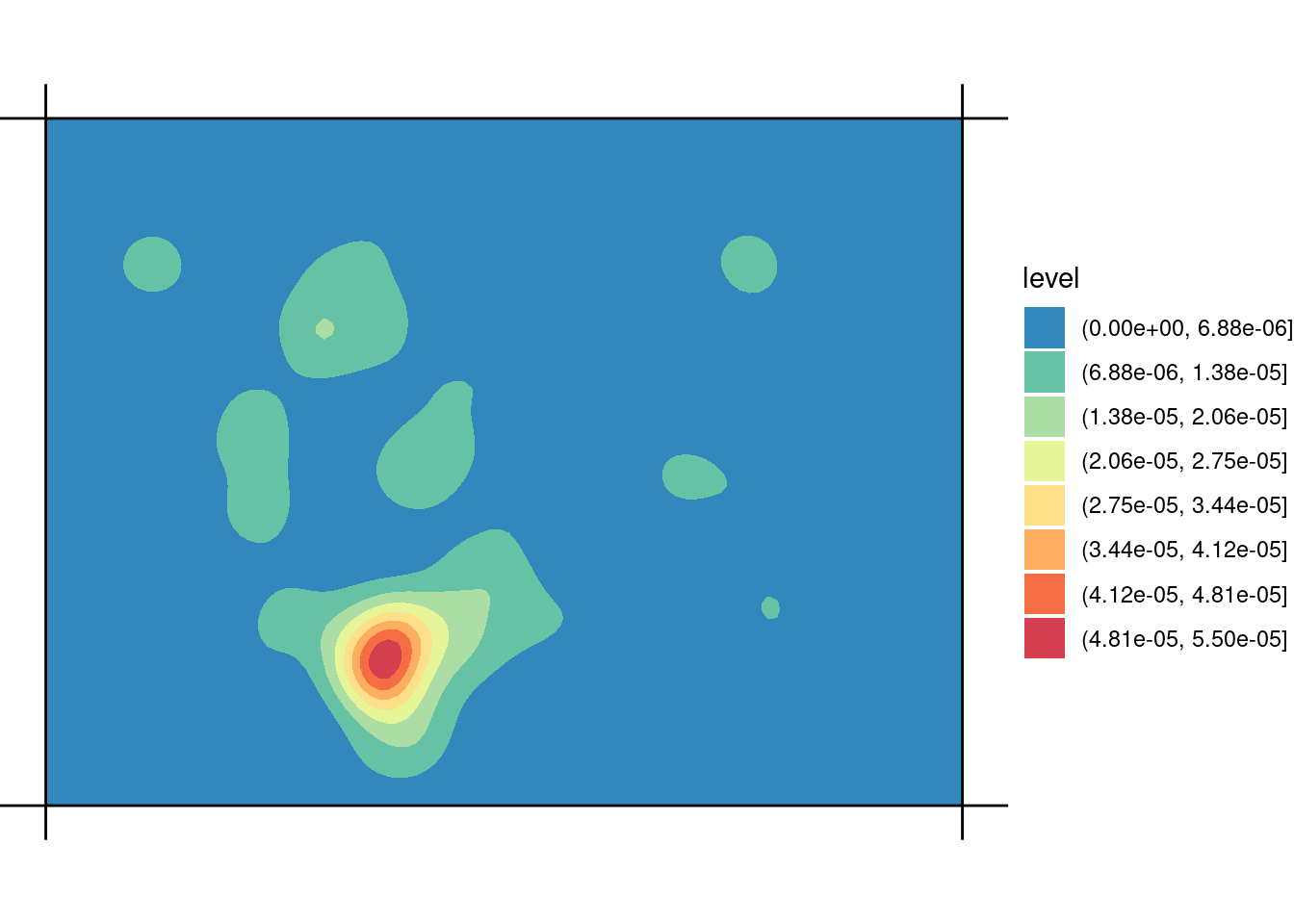
Using raster package
The raster package is maybe an older solution, which is surprisingly low demand. In 3 lines of code we get a perfectly functional plot. On the other hand, it’s not the best looking graph and we get the caveats (yes, base graphics).
r <- raster(xmn=0, ymn=0, xmx=640, ymx=480, res=20)
x <- rasterize(rat_pos[,1:2], r, fun='count')
plot(x, xlim=c(0,640), ylim=c(0,480), xaxt='n', ann=FALSE, yaxt='n')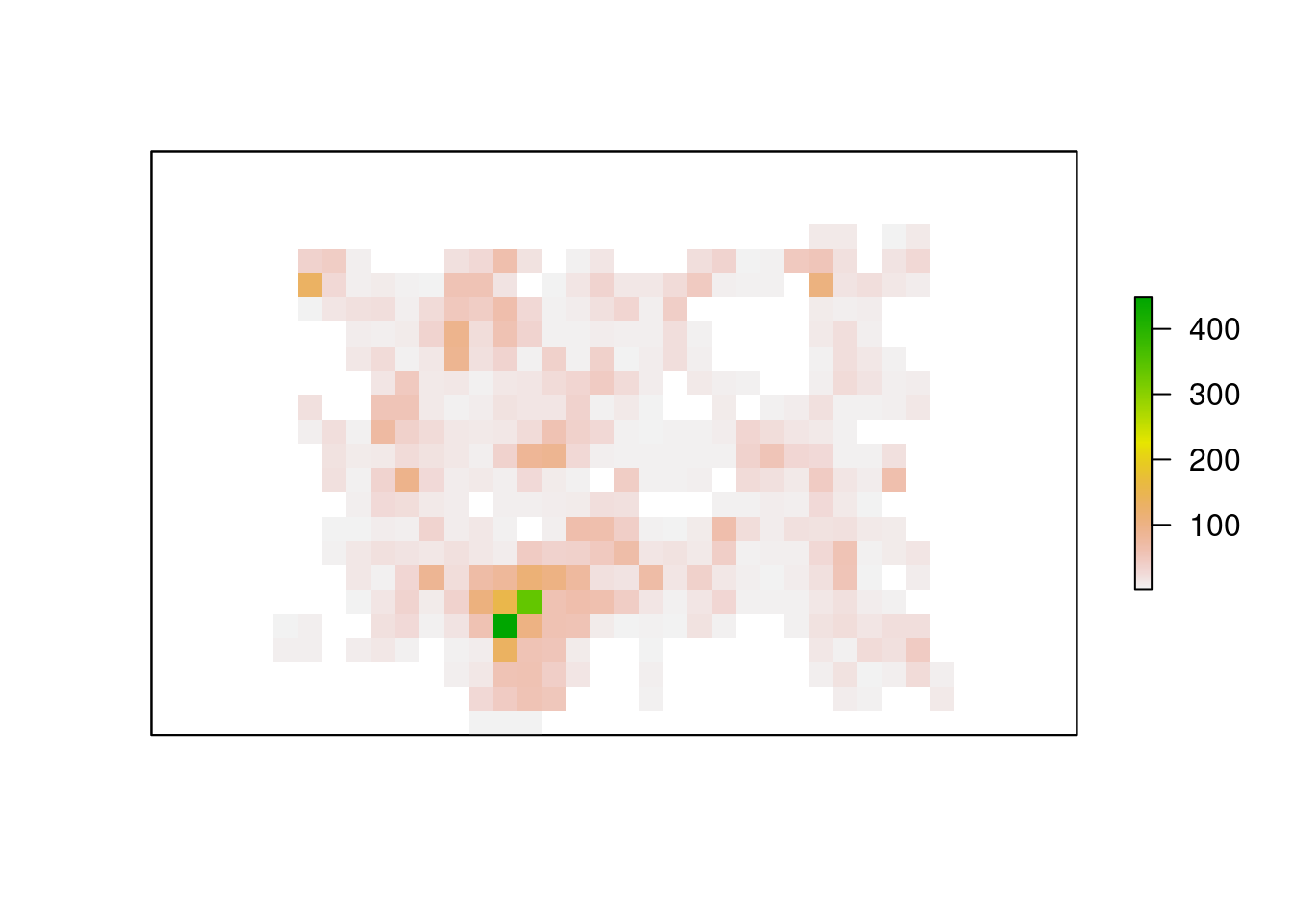
Documentation
I have found a good amount of advice and inspiration in the links below.
- http://stat405.had.co.nz/ggmap.pdf
- https://stackoverflow.com/questions/24078774/overlay-two-ggplot2-stat-density2d-plots-with-alpha-channels?lq=1
- https://www.r-bloggers.com/5-ways-to-do-2d-histograms-in-r/
- https://stackoverflow.com/questions/24845652/specifying-the-scale-for-the-density-in-ggplot2s-stat-density2d
Reuse
Citation
BibTeX citation:
@online{andina2018,
  author = {Andina, Matias},
  title = {XY-Density-Maps},
  date = {2018-07-13},
  url = {https://matiasandina.com/posts/2018-07-13-XY-density-maps},
  langid = {en}
}
For attribution, please cite this work as:
Andina, Matias. 2018. “XY-Density-Maps.” July 13, 2018. https://matiasandina.com/posts/2018-07-13-XY-density-maps.