I started participating in the Tidytuesday project to practice my visualization skills, while using datasets that come from sources that I’m not used to. In addition, I enjoy checking what other people do with the same dataset. I find that others are way more creative than I am, and I borrow heavily!
The challenge for Week 33 of 2023 was to perform viz on the spam dataset.
When PCA fails
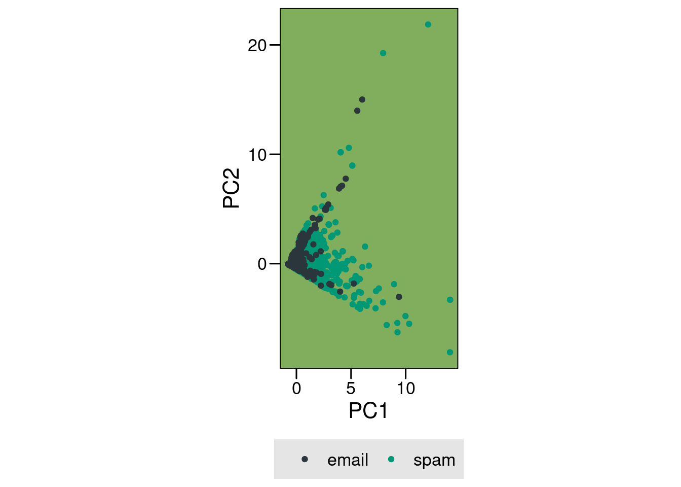
The spam dataset presents heavily skewed distributions for variables that serve as predictors of spam email. Because it was a dataset with 6 numeric variables and a single binary predictor, my initial idea was to perform a quick and dirty PCA.
Code
library(tidyverse, warn.conflicts =FALSE)library(tidytuesdayR)library(paletteer)library(FactoMineR)library(factoextra)library(scales, warn.conflicts =FALSE)# load the dataspam <-tt_load(2023, week=33)$spam
Downloading file 1 of 1: `spam.csv`
Code
spam$yesno <- dplyr::if_else(spam$yesno =="y", "spam", "email")pc <-prcomp(spam[, 1:6], center =TRUE, scale. =TRUE)# make it a tibble for ggplot plottingpc_data <- pc$x[, 1:2] %>%as_tibble()pc_data$yesno <- spam$yesnopc_ori_plot <-ggplot(pc_data, aes(PC1, PC2, color = yesno)) +geom_point() +coord_equal() +scale_color_paletteer_d("awtools::a_palette") + ggthemes::theme_base()+theme(legend.position ="bottom",plot.background =element_rect(color =NA),legend.background =element_rect(fill ="gray90"),legend.key =element_rect(fill ="gray90"),panel.background =element_rect(fill="#81AE5C")) +labs(color =element_blank())pc_ori_plot
If you are inclined to do so, you can check that fviz_screeplot(pc) gives you a horrible scree plot with very little variance explained and use fviz_pca_contrib(pc, choice = 'var') to check that the contributions of the different variables are also close to random.
Skewed Data Distributions
The vanilla PCA does nothing to help us visualize a separation between the. Why is that the case?
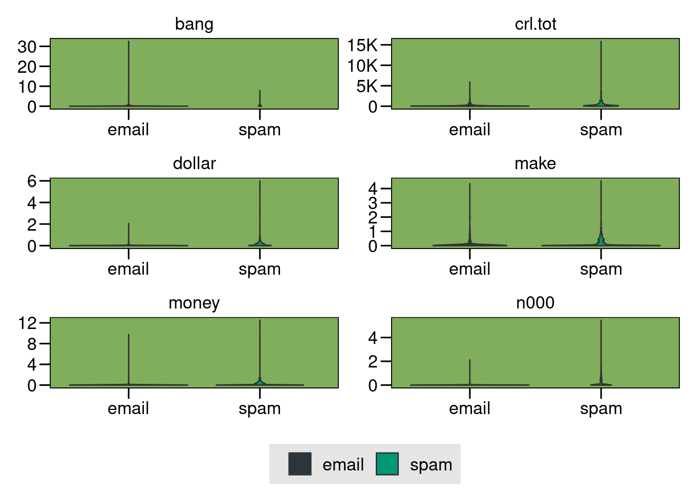
Upon a closer inspection of the regular variables, which I should have done before diving into the PCA, we see that we are dealing with heavily skewed distributions
The distributions are so skewed we can barely see them.
Transform
Enter the Yeo–Johnson transformation, a type of Power Transform1 that will come handy to normalize the data.
As a side note, I had a bit of trouble running this using the more conventional caret or recipes packages, you can read my StackOverflow question here and the nice answer about estimating parameters properly. For this post, I will be using bestNormalize::yeojohnson to normalize all columns in the dataset.
Code
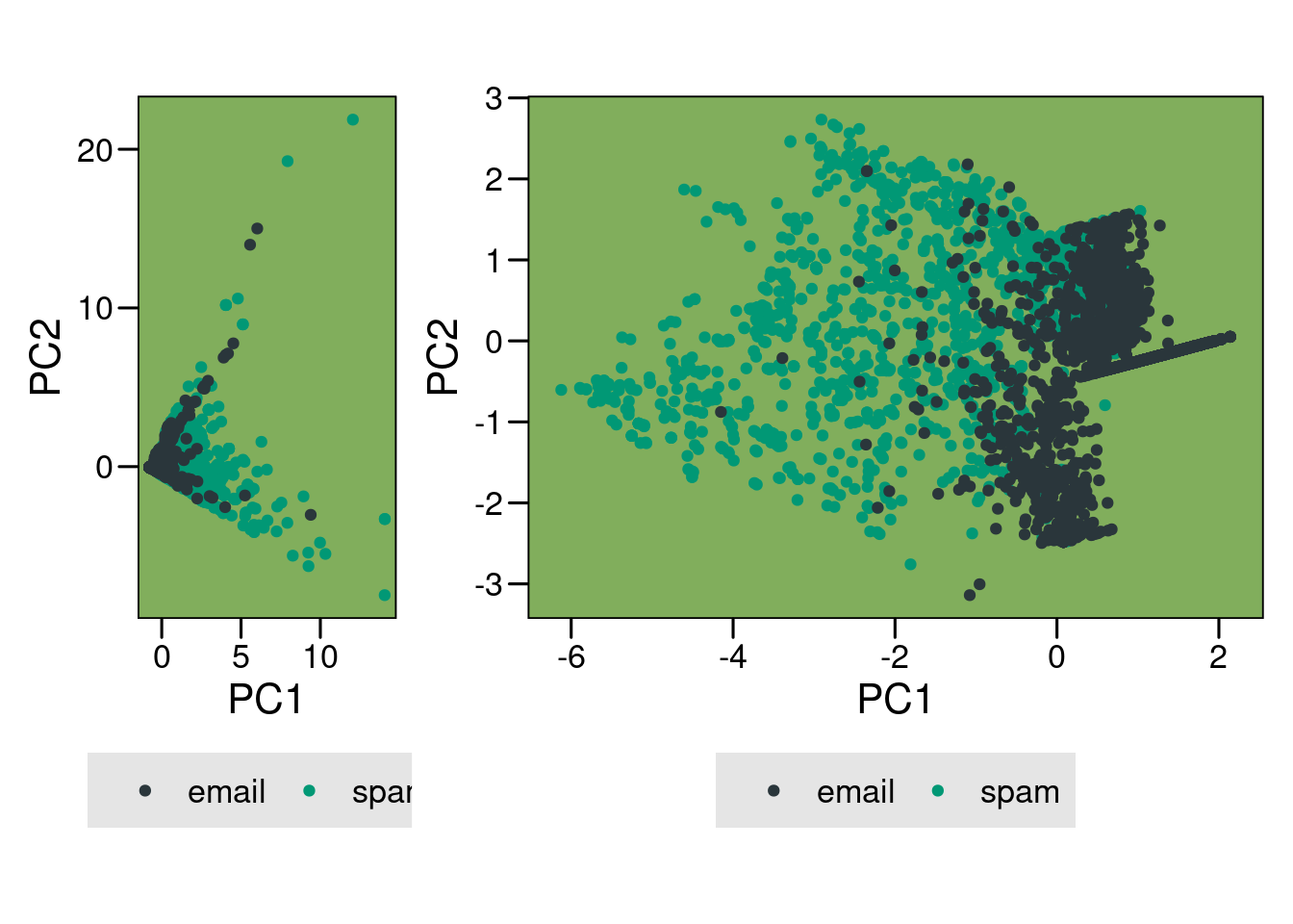
# quickly apply transformation to the data itselfdf_transformed <-select(spam, where(is.numeric)) %>%mutate_all(.funs =function(x) predict(bestNormalize::yeojohnson(x), newdata = x))# check the new distributionsdf_transformed$yesno <- spam$yesnodf_transformed %>%pivot_longer(-yesno) %>%ggplot(aes(yesno, value, fill = yesno)) +geom_violin() +facet_wrap(~name, scales ="free", nrow=3) +scale_y_continuous(labels =label_number(scale_cut =cut_short_scale()))+scale_fill_paletteer_d("awtools::a_palette") + ggthemes::theme_base() +theme(legend.position ="bottom",plot.background =element_rect(color =NA),legend.background =element_rect(fill ="gray90"),legend.key =element_rect(fill ="gray90"),panel.background =element_rect(fill="#81AE5C")) +labs(fill =element_blank(), x =element_blank(), y =element_blank())
I am not a huge fan of data transformations, but that is a very nice transformation. We often deal with skewed data, which produces difficulties when visualizing and performing data analysis. Having a tool like this power transform comes really handy2.
Second PCA
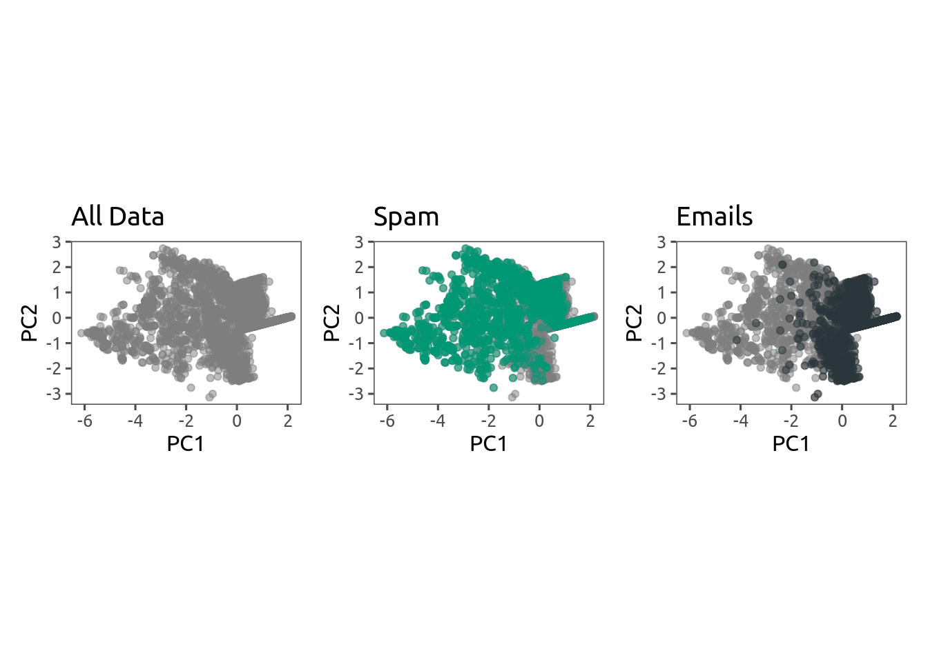
We can now check how the second PCA looks like. It’s not a panacea, but we have made large improvements. Check the side by side comparisons:
However, I encourage you to check fviz_screeplot(pc) to see how dramatically better this second PCA is.
Ending remarks
Regardless of the final separation that we could achieve in this particular dataset, the normalization performed using Yeo–Johnson transform was quite powerful. You have been given the Power to Normalize, I hope you try it on your own skewed datasets!
Footnotes
Yes, the title of this post is 100% pun intended.↩︎
The devil is on the details. Always check the parameters and be careful on data interpretation when transforming your data!↩︎
I'm so glad you're here. As you know, I create a blend of fiction, non-fiction, open-source software, and generative art - all of which I provide for free.
Creating quality content takes a lot of time and effort, and your support would mean the world to me. It would empower me to continue sharing my work and keep everything accessible for everyone.
How can you support my work?
There easy ways to contribute. You can buy me coffee, become a patron on Patreon, or make a donation via PayPal. Every bit helps to keep the creative juices flowing.
Not in a position to contribute financially? No problem! Sharing my work with others also goes a long way. You can use the following links to share this post on your social media.
Affiliate Links
Please note that some of the links above might be affiliate links. At no additional cost to you, I will earn a commission if you decide to make a purchase.